Introduction
A Line/Bar chart displays multiple time series with metric values collected over a time interval. The metric can be represented by a line chart or a bar chart. Up to two queries are supported. Click the Legend field to redirect the visualization to the detailed view of the specific resource.
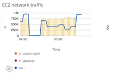
The following is an example of a combo chart generated by a usage_cloud_provider_aws{instance="ec2.instances"} PromQL query:
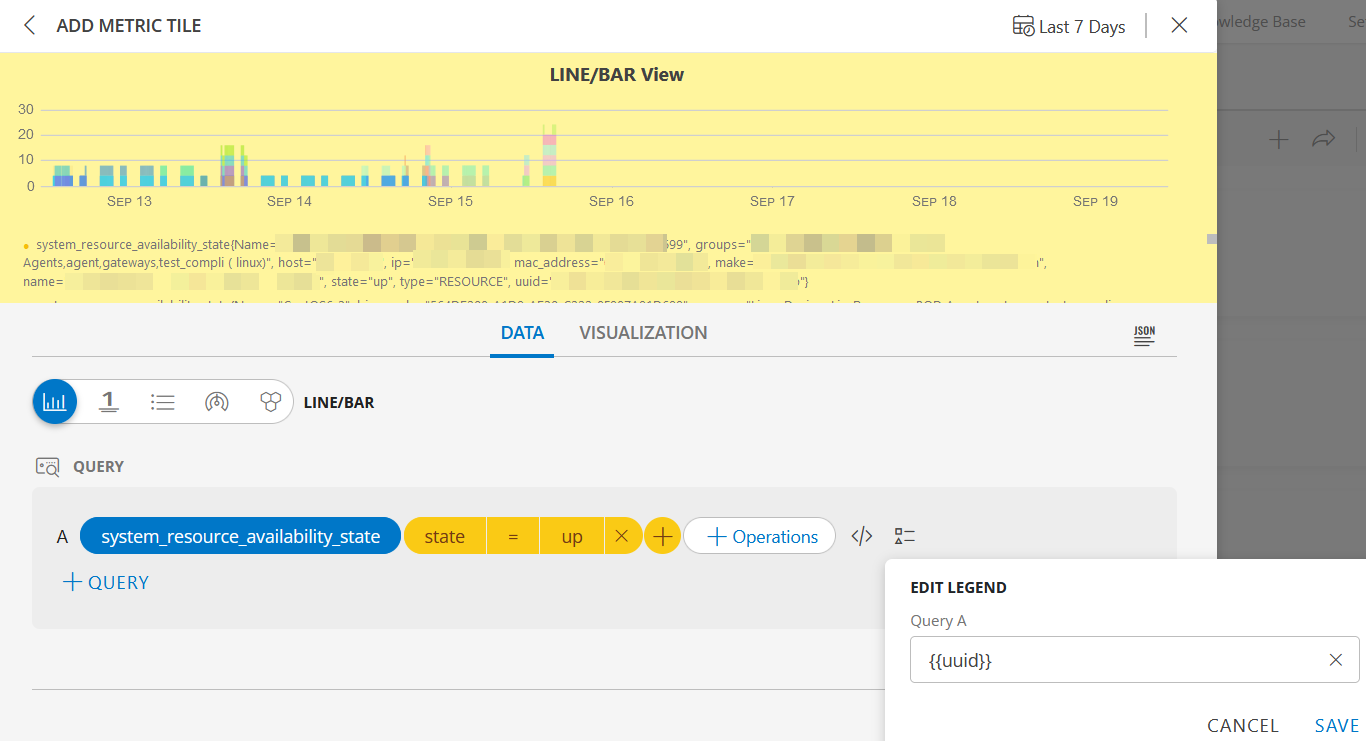
LINE/BAR visualization for Metric Tile
The following is the LINE/BAR visualization with the inputs:
- Metric =
system_resource_availability_state - Filter =
state = up - Legend =
uuid
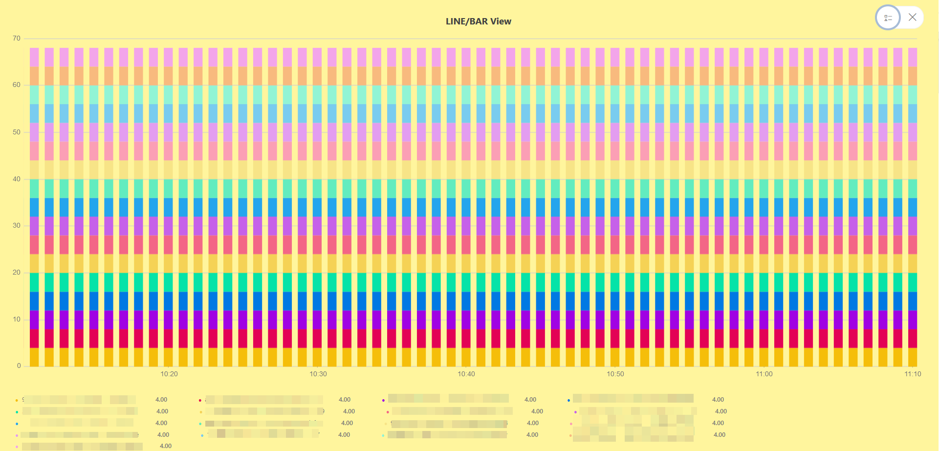
LINE/BAR dashboard view
The following is the LINE/BAR dashboard view:
LINE/BAR Visualization for Alert Tile
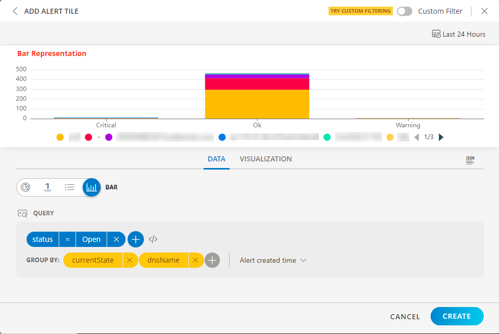
BAR visualization
The following is the BAR visualization with the inputs:
- Attribute -
status = Open - Group By
- Attribute 1 =
currentState - Attribute 2 =
dnsName
- Attribute 1 =
- Duration =
Last 24 Hours Alert created time is selected.
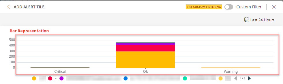
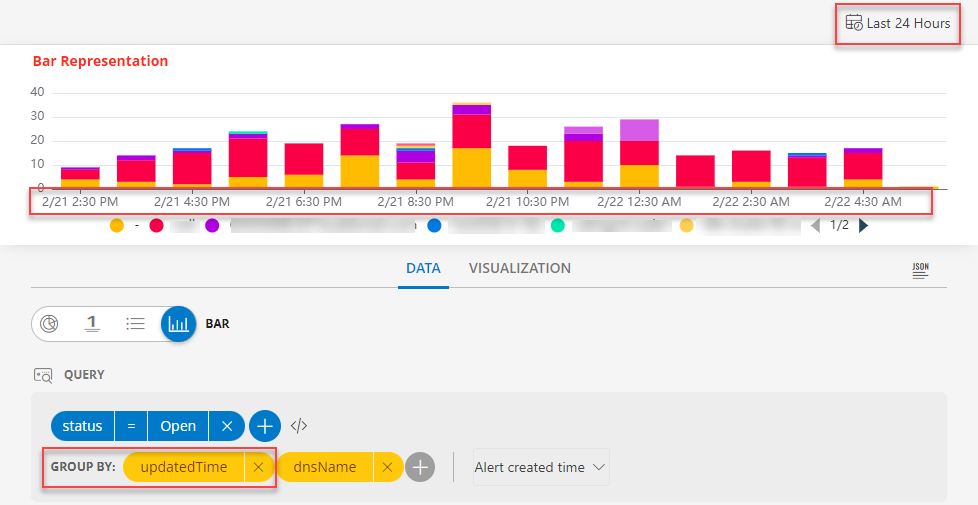
BAR dashboard view
The following is the BAR dashboard view when Alert created time is selected:
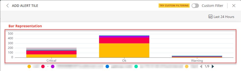
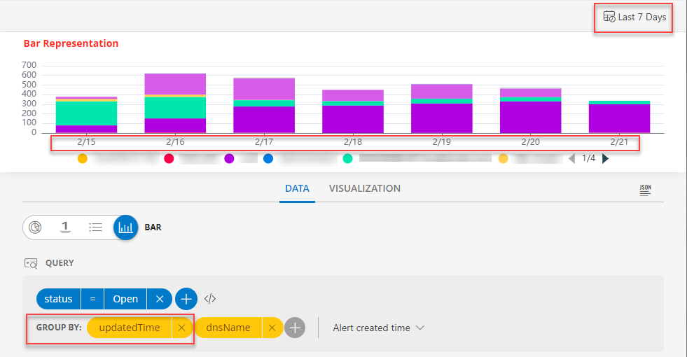
The following is the BAR dashboard view when Alert updated time is selected:
Notes:
- The Alert created Time option displays results when the alert was created.
- The Alert updated Time option displays the results when the alert was updated.
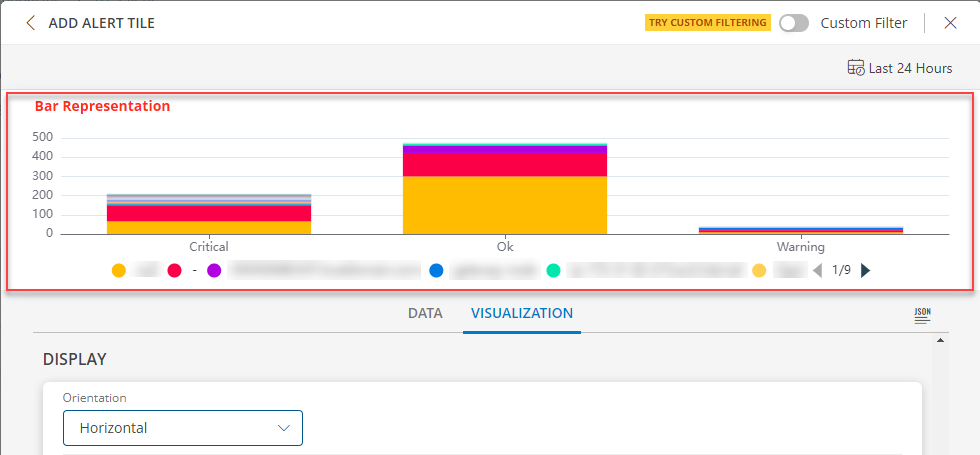
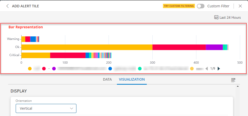
- Select Horizontal or Vertical representation of the data from the Orientation dropdown list box in the Visualization tab.
Notes: By default the Horizontal axis is enabled.
Horizontal Axis view
Vertical Axis View
Notes:
If the updatedTime or createdTime attribute is selected in the Group BY field and the time range is less than or equal to 24 hours, time and date is displayed below the bar visualization.
If the time range is more than 24 hours, only the date is displayed below the bar visualization.
- Click the stacked bar to display the multiple group information.
- Per query, Time Series tile displays up to 30 series which are mapped to the order of this color chart. You may click a swatch to edit color or click + drag to reorder.
- You may enable and disable a legend by clicking the name/color of the specific legend.
- Click Go Back to return to the view all the legends.
Sites
Use the resource.location attribute to query sites in the Alert tile.
Below are the views you can create using the OpsQL query:
- Site wise open alerts view
- Site wise ticketed alerts view
Site wise open alerts view
Query: status = OPEN
Group By: resource.location
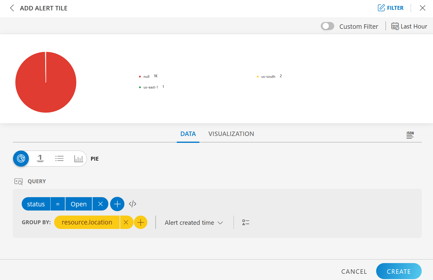
It shows all the location wise open alerts. You can use another Group By attribute to filter.
Site wise ticketed alerts view
Query: status = TICKETED
Group By: resource.location
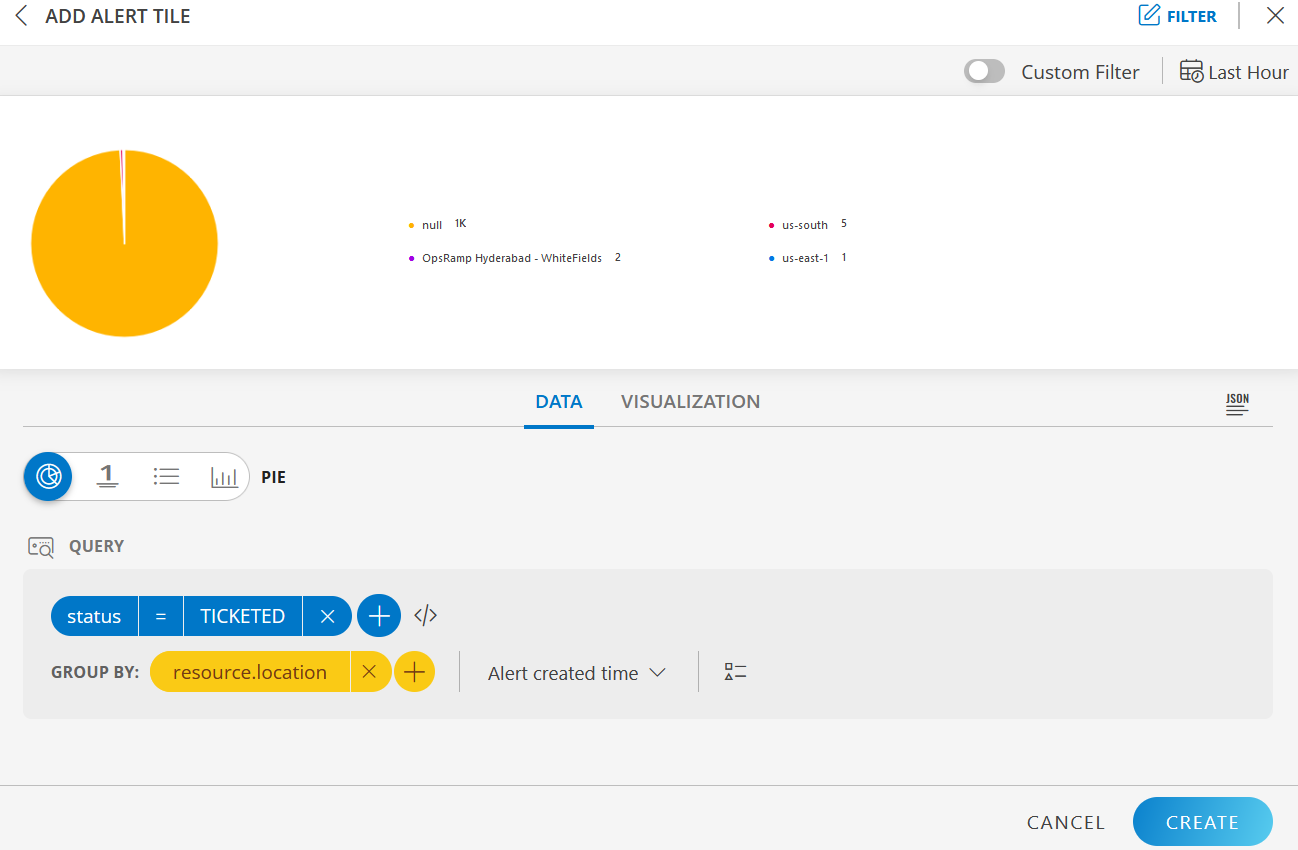
It shows all the location wise ticketed alerts. You can use another Group By attribute to filter.
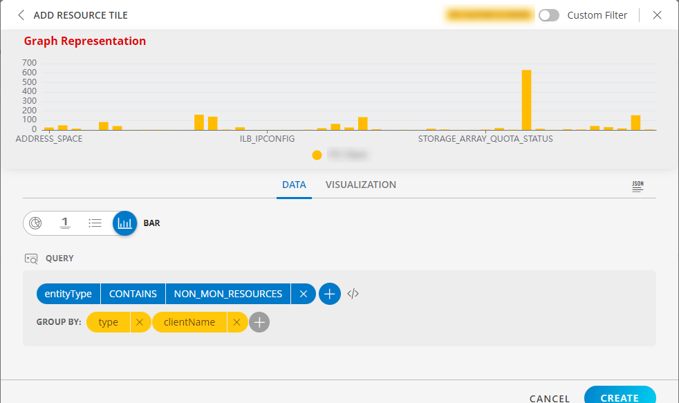
LINE/BAR Visualization for Resource Tile
BAR visualization
The following is the BAR visualization with the inputs:
- Attribute -
entityType CONTAINS NON_MON_RESOURCES - Group By
- Attribute 1 =
type - Attribute 2 =
clientName
- Attribute 1 =
Notes:
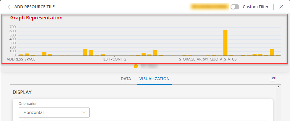
- Select Horizontal or Vertical representation of the data from the Orientation dropdown list box in the Visualization tab.
Note: By default the Horizontal axis is enabled. - Click the stacked bar to display the multiple group information.
- Per query, Time Series tile displays up to 30 series which are mapped to the order of this color chart. You may click a swatch to edit color or click + drag to reorder.
- You may enable and disable a legend by clicking the name/color of the specific legend.
- Click Go Back to return to the view all the legend.
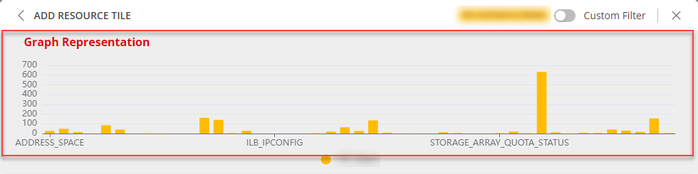
BAR dashboard view
The following is the BAR dashboard view:
Horizontal Axis view
Vertical Axis View
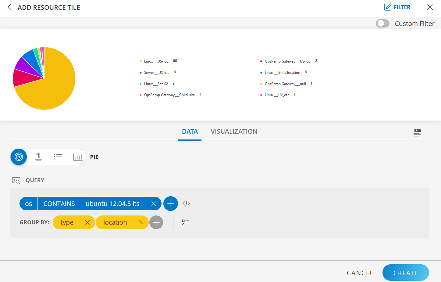
Sites
Use the location attribute to query sites in the Resource tile.
The following example shows location wise and resource type wise resources whose operating system contains “ubuntu”.
Query: os CONTAINS ubuntu
Group By: location and type
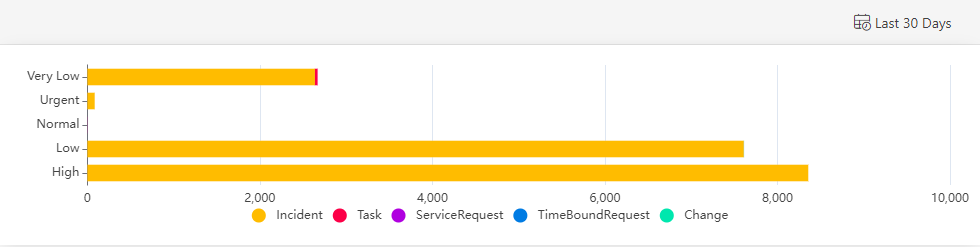
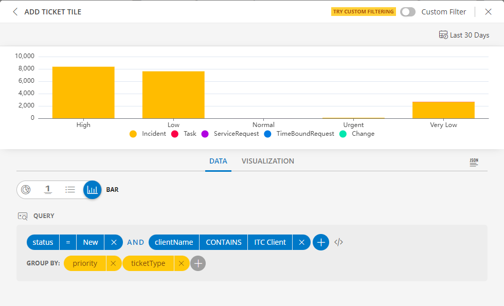
LINE/BAR Visualization for Ticket Tile
BAR visualization
The following is the BAR visualization with the inputs:
- Attribute -
status = New - Group By
- Attribute 1 =
priority - Attribute 2 =
ticketType
- Attribute 1 =
Notes:
- Select Horizontal or Vertical representation of the data from the Orientation dropdown list box in the Visualization tab.
Note: By default the Horizontal axis is enabled. - Click the stacked bar to display the multiple group information.
- Per query, Time Series tile displays up to 30 series which are mapped to the order of this color chart. You may click a swatch to edit color or click + drag to reorder.
- You may enable and disable a legend by clicking the name/color of the specific legend.
- Click Go Back to return to the view all the legends.
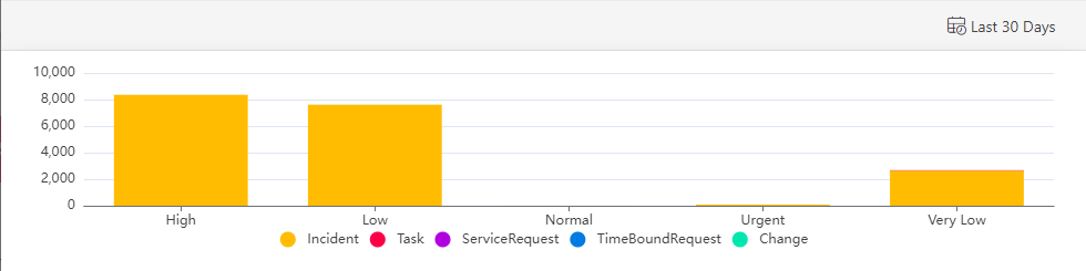
BAR dashboard view
The following is the BAR dashboard view:
Horizontal Axis view
Vertical Axis View