Permissions
See Using RBAC for more information.
Note: The Metric tile is available only at the Client level.
Create a Metric Tile
Follow these steps to create a metric tile:
From Dashboard > Dashboard 2.0, create a new dashboard or select from an existing dashboard collection.
See Create Dashboards to learn about creating dashboards.
Click CREATE TILE or + from the toolbar.
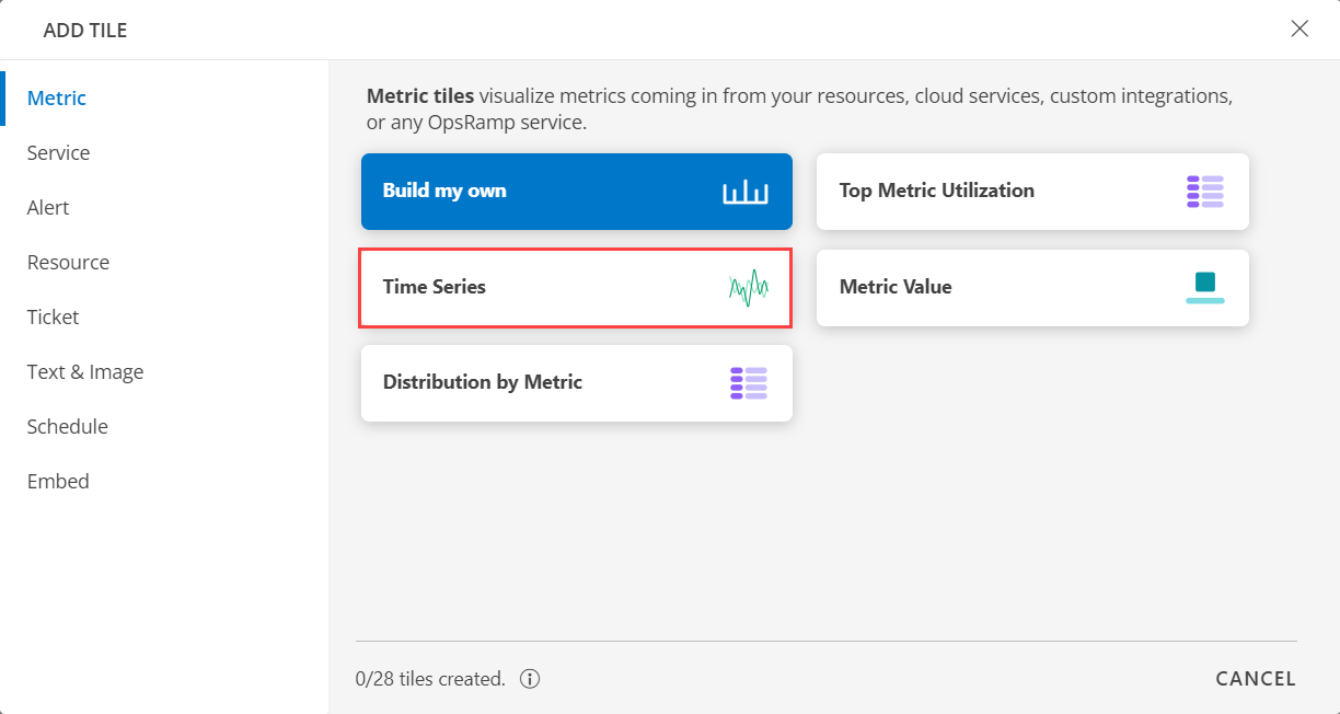
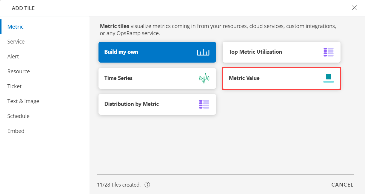
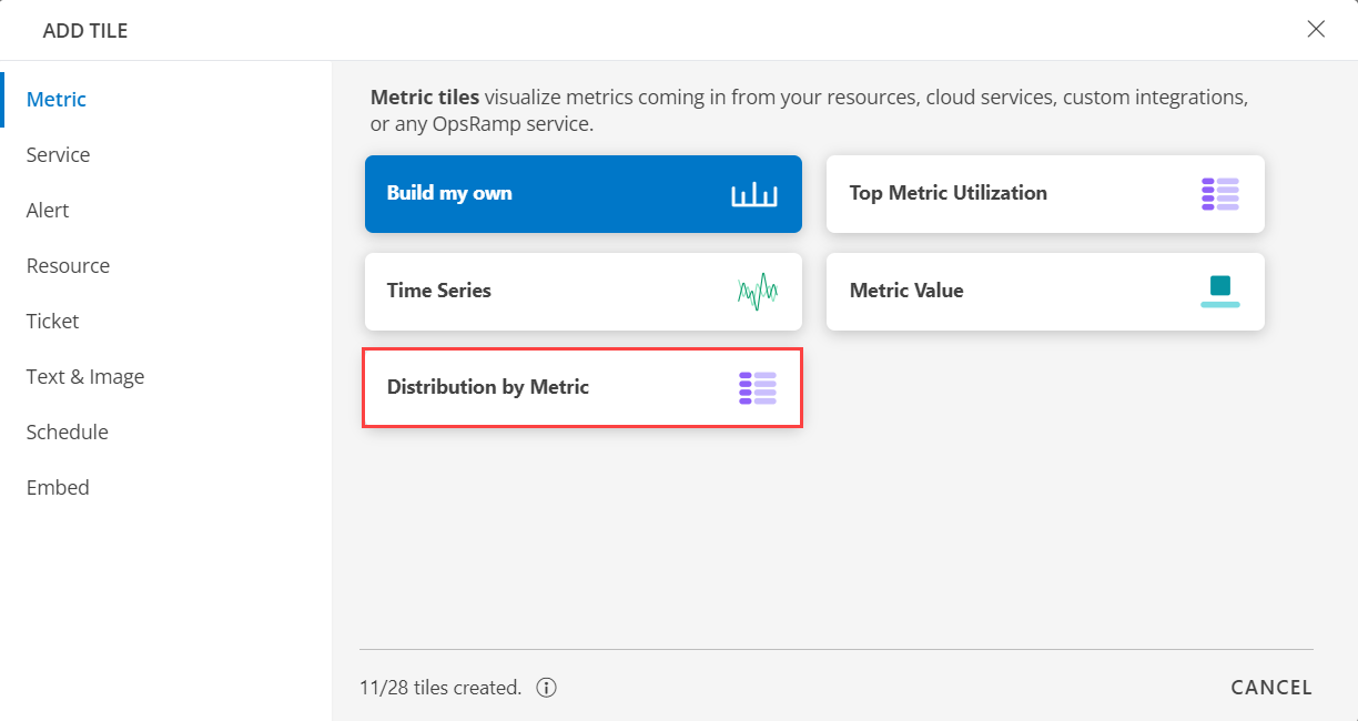
In the ADD TILE screen that appears, select Metric.
The following screen is displayed:

Note
Metric tiles, when displaying dynamic metric data that frequently changes, is updated every 90 seconds, i.e., every 3 minutes. Line graphs may not display continuous lines for metrics associated with the Groups label, resulting in visual gaps.
As part of metric data series line visualization enhancements to display sorted metric streams, users may experience gaps in line graphs for metrics queried with the Groups label.
- Select one of the following:
| Tile Option | Functionality |
|---|---|
| Build my own | Visualize metrics coming in from your resources, cloud services, custom integrations, or any OpsRamp service. |
| Top Metric Utilization | Visualize top 10 resources by Metric Utilization. |
| Time Series | Visualize the time series Metric Data. |
| Metric Value | Visualize the overall average CPU utilization of resources. |
| Distribution by Metric | Visualize distribution of resources by CPU utilization. |
Build My Own
Click here to view how to Build Your Own Query
- Select the Build my own tab. This enables you to create a custom tile.

- Click the + QUERY and select the options from the following drop-down lists as you build the query:
- Metrics - Select any metric that is being sent to OpsRamp or an OpsRamp-generated metric.
- Filters - Select to filter the metrics based on the tags or labels that are present on those metrics.
Note: You can add up to a maximum of three queries in the metric tile. This applies to only Line/Bar, Value, and List graph representations. For the remaining graph representations, the limit is one.
Resource group
Filter metrics based on a resource group.
While building the query:
Select the metric and click +Filters.
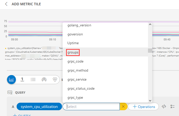
- Select groups from the list of tags.
Note: You can also search using the search box. - Select the operator and the value. The metric tile shows the metric details based on the resource group.
- You can also use a dashboard variable as a value.
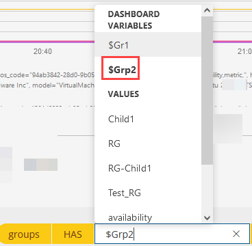
Note: A resource can be a part of one group or multiple groups. These groups appear as a comma-separated list in the metric series.
Sites
Filter metrics based on a Site.
While building the query:
Select the metric and click +Filters.
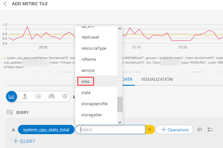
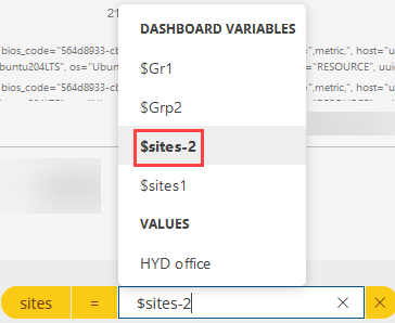
Select sites from the list of tags. You can also search using the search box. Select the operator and the value. The metric tile shows the metric details based on the site.
You can also use a dashboard variable as a value.
Service Map name
Filter a metric by the service map name.
- While building the query:
- Select the metric and click +Filters.
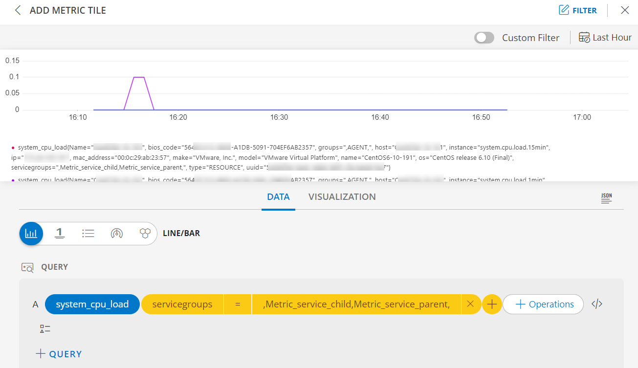
- Select servicegroups from the list of tags. You can also search using the search box. Select the operator and the value. The metric tile shows the metric details based on the service map.
- If a resource is added in two service maps, then the service groups data should be seen in comma-separated values.
- You can also use a dashboard variable as a value.
Custom Attributes
Use custom attributes when querying metrics.
- Define custom attributes on the resources. Use these custom attributes to graph metric data.
- While building the query:
- Select the metric and click +Filters.
Select the custom attribute, the operator and the value from the list of tags.
Note: You can also search using the search box.
The metric tile displays the metric series for all the resources that are tagged with the custom attributes for the specific metric.
It takes 24 hours for the custom attribute labels to be displayed on the metric series.
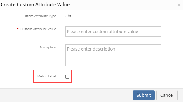
If you do not select the Metric Label checkbox while creating a custom attribute value, it will not be visible when you edit the custom attribute value.
Metric label enabled custom attributes have limits. A maximum of 5 metric labels can be enabled per device.
The metric label enabled custom attributes are displayed in the resource details page, in the Attributes section. This will allow you to decide which of the custom attributes you can consider as a label for the metrics.
Operations - You can select a maximum of two operations ranging from aggregations such as average or summation to mathematical functions like logarithms or absolute values. You can use
min,max,avg,topk,bottomkfor the series generated.
The preview graph is displayed as you build the query.Note
In order to view a function in the UI, an advanced query builder function must be used. For example:max_over_time, ormin_over_timeAdvance Query - click </> to use the advanced query builder. Click </> again to close the advanced query field and switch to the basic query builder format.
Note: If you make changes in the advanced query builder, you cannot switch back to the basic query builder.- Start typing a query and choose either a function or metric from the dropdown that appears, if you are using the advanced query option.
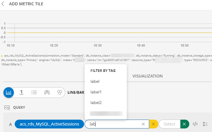
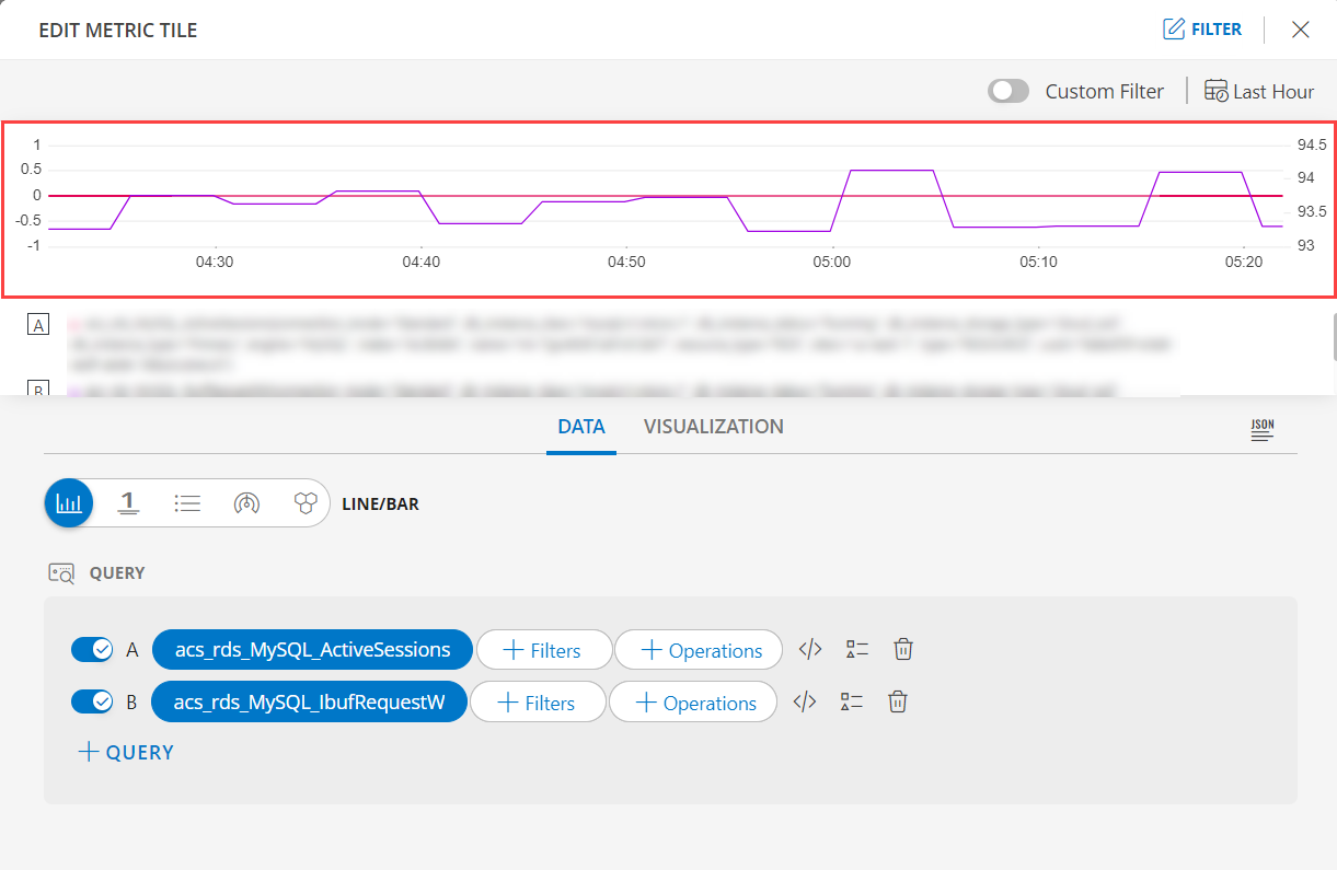
See QUERYING PROMETHEUS to learn about PromQL queries. - Y-Axis Scaling: Y-axis dynamically adjusts when multiple queries are added, enabling effective comparison between queries with different ranges of values.
The following is the Y-Axis Scaling visualization with the inputs:- Metric A =
acs_rds_MySQL_ActiveSessions - Metric B =
acs_rds_MySQL_ibufRequestW
- Metric A =
- Start typing a query and choose either a function or metric from the dropdown that appears, if you are using the advanced query option.
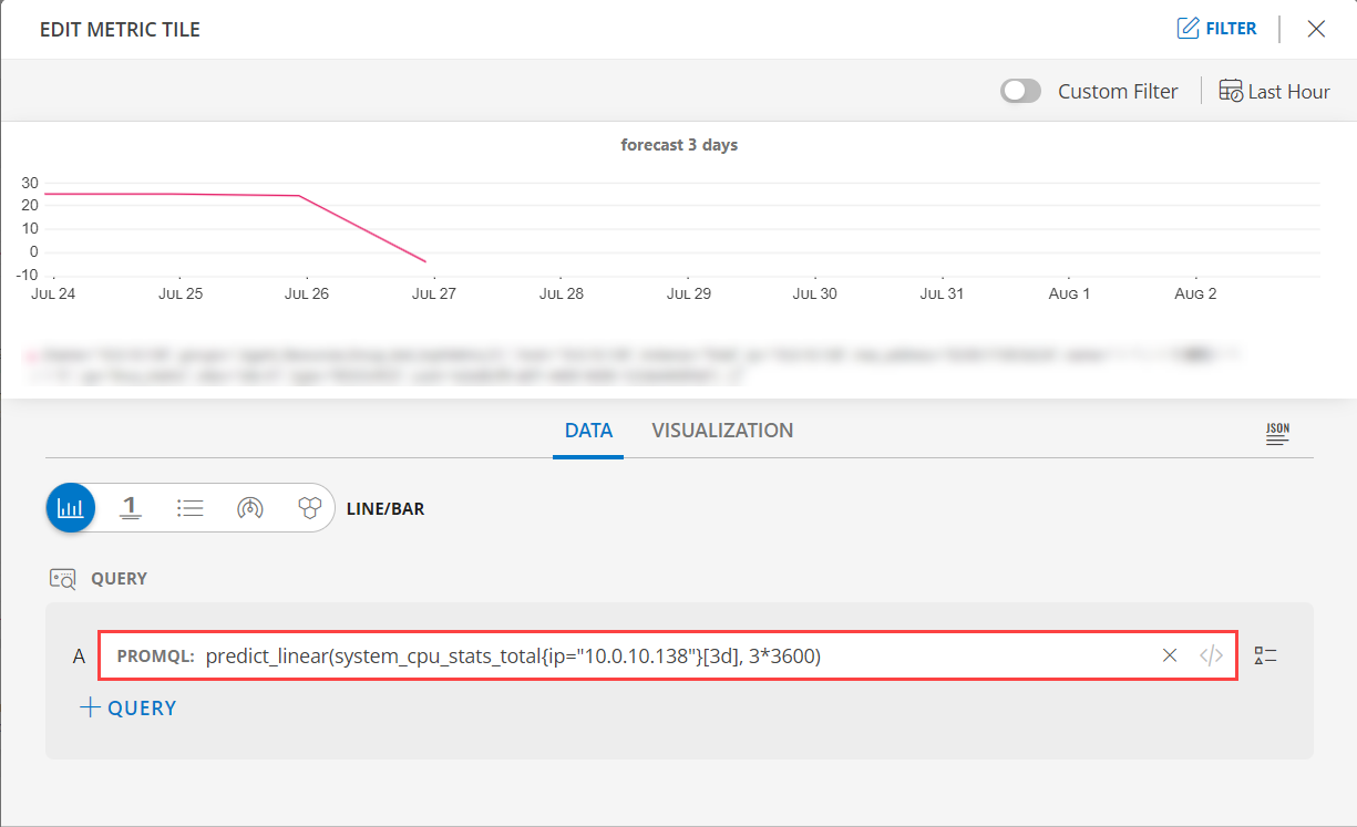
Forecast Graph: The forecast graph provides flexibility for you to specify a Prometheus query expression, enabling you to predict and visualize the forecasted value of time series data for the given metric.
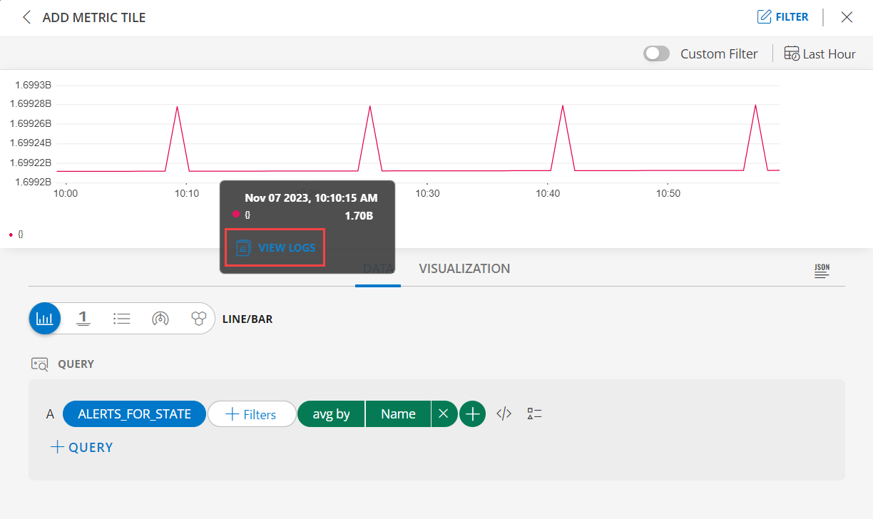
You can also seamlessly navigate from any metric tile, with the specific time frame and relevant tags, to the log explorer simplifying the task of correlating metric data with log data, ensuring a streamlined and contextually relevant experience.
- Hover over the graph and click on any point, the VIEW LOGS is displayed.
- Click VIEW LOGS.
Note: click the VIEW LOGS again to close the drilldown.
Note: A maximum of 10 days can be predicted.
Below is an example query using promql expression to display the forecast of a metric.
Metric A:
predict_linear(system_disk_utilization{host="device1"}[5d], 30*24*60*60)
In the above example,
Example: View the CPU, memory, disk metrics for a specific group of resources that are tagged with specific custom attributes.
Note: When creating a custom attribute value (in the Setup > Custom Attributes page), select the Metric Label checkbox. Only then the custom attribute will be considered as a label for the resource metrics.
Click here for more information on Custom Attributes.
| PROMQL Value | Description |
|---|---|
| predict_linear | promql expression to forecast the metric data. |
| system_disk_utilization | metricName for which the time series forecasting is to be visualized. |
| host | Device name for which the forecast is to be visualized |
| "5d" | Forecasting future window to predict and display the metric data for the next 5 days. Users can define based on the required prediction time period. |
| 30*24*60*60 | Learning time window, to look back 30 days of data to generate the forecasting analysis trend. |
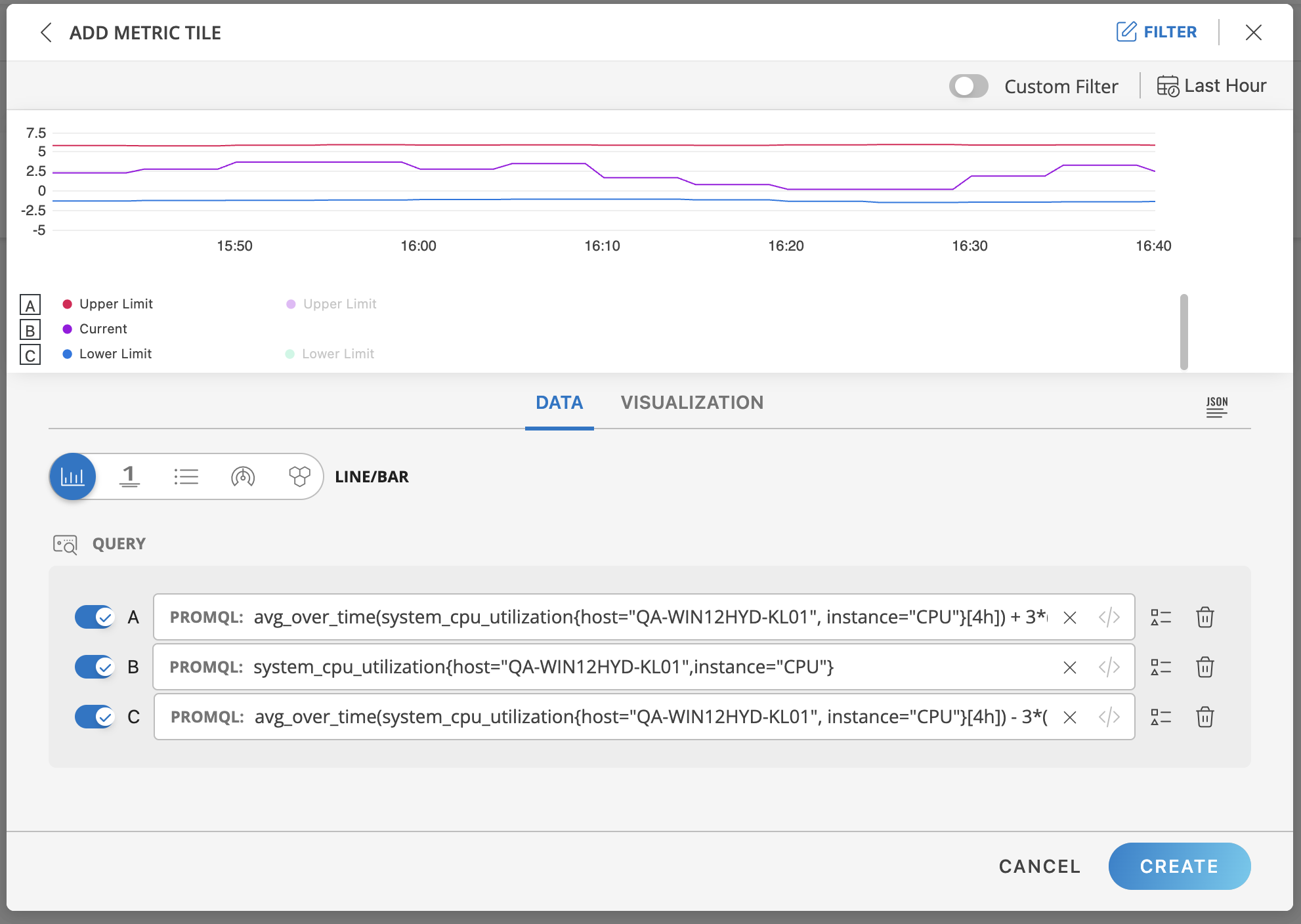
- Change Detection: The change detection provides flexibility in visualizing change detection patterns. You can now define the below expressions in your Prometheus query to generate and visualize the change detected occurrences.
- Upper limit.
- Actual Value.
- Lower Limit.
- Below is an example of how these expressions are used to show change detection in the metric tile:
UpperLimit: avg_over_time(system_cpu_utilization{host=“QA-WIN12HYD-KL01”, instance=“CPU”}[4h])) + 3*(stddev_over_time(system_cpu_utilization{host=“QA-WIN12HYD-KL01”, instance=“CPU”}[4h]))
Actual Value: system_cpu_utilization{host=“QA-WIN12HYD-KL01”, instance=“CPU”}
For LowerLimit: avg_over_time(system_cpu_utilization{host=“QA-WIN12HYD-KL01”, instance=“CPU”}[4h])) - 3*(stddev_over_time(system_cpu_utilization{host=“QA-WIN12HYD-KL01”, instance=“CPU”}[4h]))
In the above example,
| PROMQL Value | Description |
|---|---|
| "system_cpu_utilization" | metricName. |
| "4h" | The learning duration, which users can customize between 1h to 24h based on the requirements. |
| "3" | Sensitivity factor which is the multiple of standard deviations from the mean value, users can give any number but the recommended value would be below 10. |
- Click the optional Legend icon and enter {{ in the Query a Legend field to see a list of options.
- Select the data type from the following options:
| Chart Type | Description |
|---|---|
| Line/Bar | Displays a time series graph with metric values collected over a time interval. Combining Line and Bar Charts for Metrics Series Visualization: To visualize metric data series using two metrics, follow these steps:
 |
| Value (single value) | Displays a single value. |
| List | Displays values in a list format. |
| Gauge | Displays multiple time series using a gauge graphic. |
| Honeycomb | Displays multiple time series in a hexagonal graphic. |
- Click SAVE to view the results based on your selection. Hover over the results on the preview graph to view them individually.
- Select the Value option to view the results as a single value.
Note: You can add upto three queries, however, you will no longer be able to create additional ones.
You can sort the queries in ascending or descending order. This option is available for the List visualization.
Select the Instant toggle to view the most recent value for a given metric.
Note:
- The Instant option is available only for List, Gauge, and Honeycomb chart types.
- Enable the Instant button to get the accurate results for topk and bottomk functions.
Click the Last Hour to select the duration for which the data needs to be retrieved. The duration can be selected for:
- Last Hour
- Last 4 Hours
- Last 8 Hours
- Last 24 Hours
- Last 7 Days
- Last 15 Days
- Last 30 Days
- Month to Date
See Visualization to know on how to customize the Metric Tile.
Click Create.
The Metric tile is created and displayed on the main dashboard page.
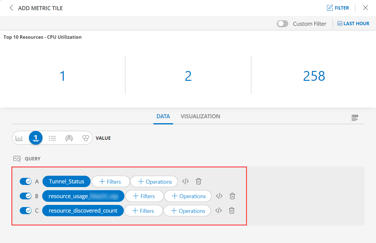
Top Metric Utilization
Click here to view how to Top Metric Utilization
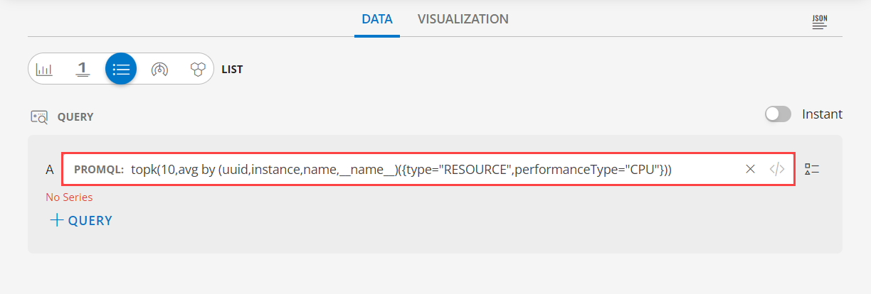
- Select the Top Metric Utilization tab.

The default PROMQL query is already generated. Below is the PromQL:
topk(10,avg by (uuid,instance,name,__name__)({type="RESOURCE",performanceType="CPU"}))
To find maximum/minimum CPU utilization in an hour for a resource:
  min_over_time | (min by     | (uuid,instance,name)      | ({performanceType="CPU", | type="RESOURCE"})  | [1h:])
  VALUE SORT    | (value by   | (data tag sort sequence)  | (metric on resource.     | Select Query)      | Duration
Examples:
  * min_over_time(max by (uuid,instance,name) ({performanceType="CPU",type="RESOURCE"})[1h:])

  * max_over_time(max by (uuid,instance,name) ({performanceType="CPU",type="RESOURCE"})[1h:])
To find average CPU utilization in an hour for a resource:
  avg_over_time | (avg by     | (uuid,instance,name)      | ({performanceType="CPU", | type="RESOURCE"})  | [1h:])
  VALUE SORT    | (value by   | (data tag sort sequence)  | (metric on resource.     | Select Query)      | Duration
Example:
* avg_over_time(max by (uuid,instance,name) ({performanceType="CPU",type="RESOURCE"})[1h:])Note: You also have the option to edit the PROMQL.
- See Visualization to know on how to customize the Metric Tile.
- Click Create.
The Metric tile is created and displayed on the main dashboard page.
Time Series
Click here to view how to Time Series
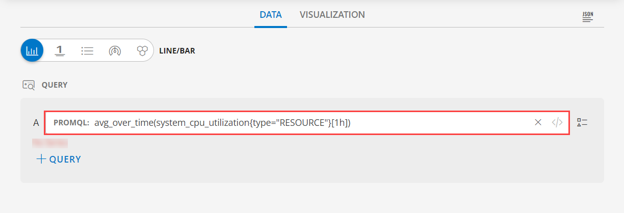
- Select the Time Series tab.
- The default PROMQL query is already generated. Below is the PromQL:
avg_over_time(system_cpu_utilization{type="RESOURCE"}[1h])Note: You also have the option to edit the PROMQL.
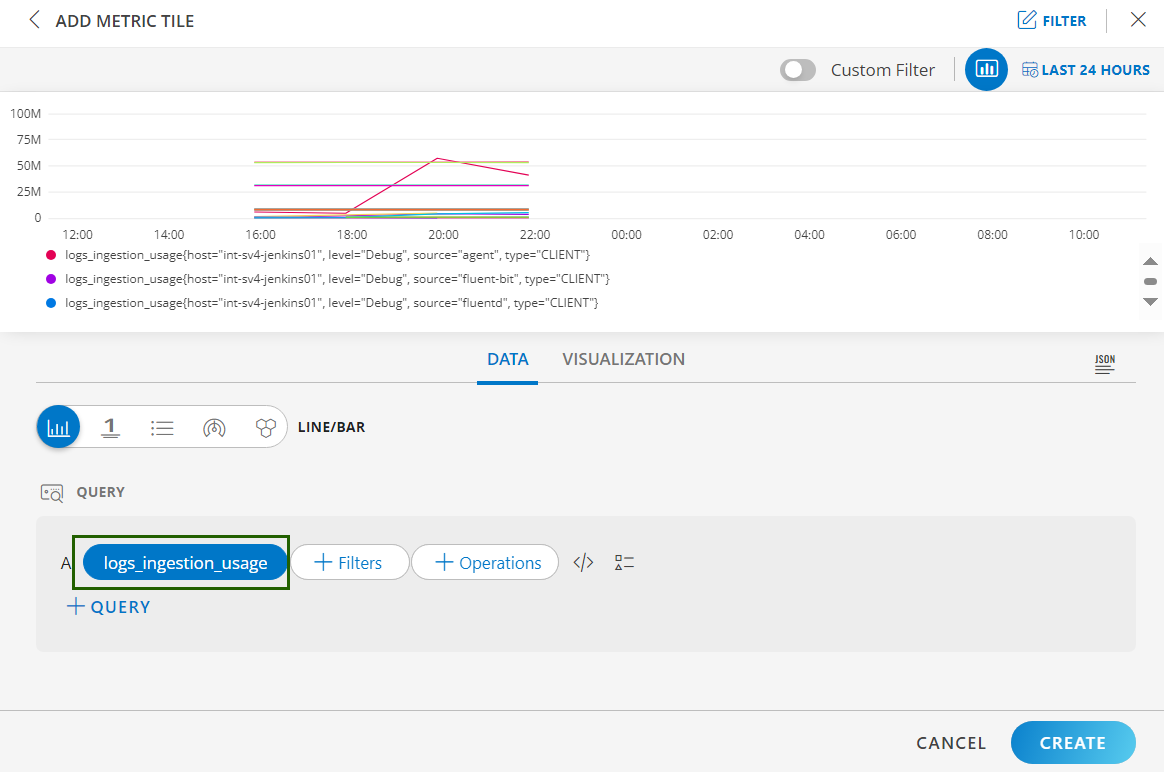
- You may also add
logs_ingestion_usagemetric. This feature enables you to track and visualize logs usage for the selected clients across different sources, levels, and hosts.
- See Visualization to know on how to customize the Metric Tile.
- Click Create.
The Metric tile is created and displayed on the main dashboard page.
Metric Value
Click here to view how to Metric Value
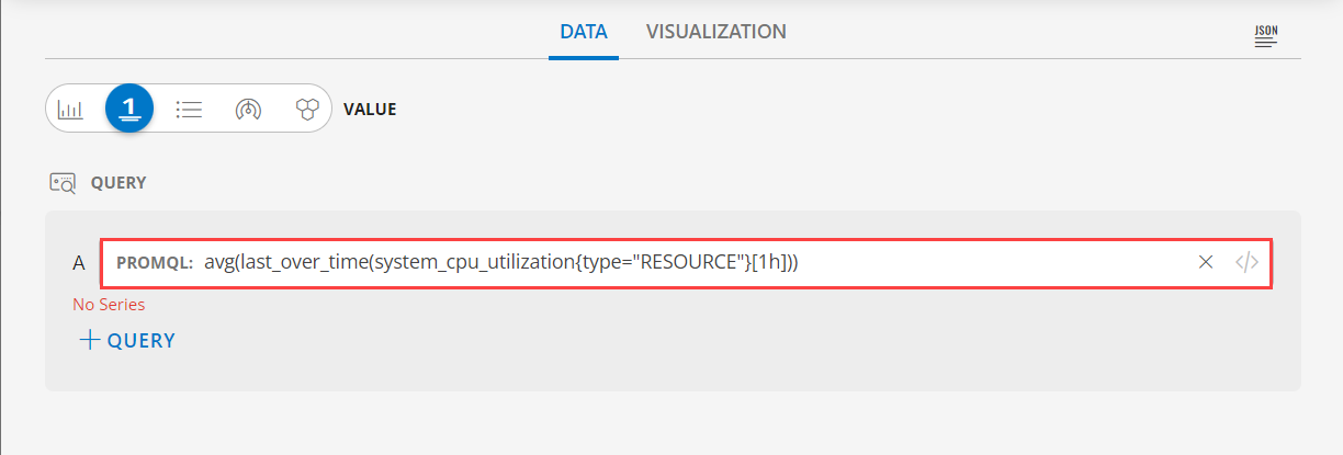
- Select the Metric Value tab.
- The default PROMQL query is already generated. Below is the PromQL:
avg(last_over_time(system_cpu_utilization{type="RESOURCE"}[1h]))Note: You also have the option to edit the PROMQL.
- See Visualization to know on how to customize the Metric Tile.
- Click Create.
The Metric tile is created and displayed on the main dashboard page.
Distribution by Metric
Click here to view how to Distribution by Metric
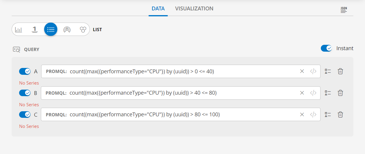
- Select the Distribution by Metric tab.
- The default PROMQL query is already generated. Below are the PromQL:
count((max({performanceType="CPU"}) by (uuid)) > 0 <= 40)count((max({performanceType="CPU"}) by (uuid)) > 40 <= 80)count((max({performanceType="CPU"}) by (uuid)) > 80 <= 100)Note: You also have the option to edit the PROMQL.
- See Visualization to know on how to customize the Metric Tile.
- Click Create.
The Metric tile is created and displayed on the main dashboard page.
Visualization
- Click the Visualization tab to customize the visualization further:

- TILE:
| Label Name | Description |
|---|---|
| HEADER | Set a name, color, size, and alignment for the header. |
| Grid Lines | Select the color of the grid lines, enable or disable the grid lines by clicking the toggle ON or OFF, Grid Lines option. Note: By default the Grid Lines is enabled |
| Background Color | Select the background color, enable or disable the background color by clicking the toggle ON or OFF background color. Note: By default the Background Color is disabled. |
- DISPLAY:
| Functionality | Description |
|---|---|
| Graph | Choose Line or Bar. Note: When you select the Line graph, you can select the Line and Point Size. |
| Count Decimal | Select the Decimal count from the drop down list box. |
| Data Color Mapping | Per query, Time Series tile displays up to 30 series which are mapped to the order of this color chart. You may click a swatch to edit color or click+drag to reorder. |
| Legend | Select the color and the size of the Legend Note: By default Legend checkbox is selected. |
| Tooltip | You can append measurement units to metric values in the legend to make them more understandable.
 Note: This feature applies only to Line and Bar graph representations. |
- Note: For multiple queries in the tile, you can change each query representation for either bar or line chart, or both.

- AXIS:
| Functionality | Description |
|---|---|
| X-axis label | Enter a label for the X-axis. Example: Time. |
| Y-axis label | Enter a label for the Y-axis. Example: Based on the metric name, you can provide a relevant label. For instance, if the metric name is apigee_apiproxy_request_processing_latency, you can enter Latency as the label.
 |
| Y-axis range | You can set the minimum and maximum values for the Y-axis range. By defining these values, you adjust the Y-axis scale, making it easier to visualize data within a specific range.
0-668.Setting values of 0 as MIN and 250 as MAX will adjust the visualization accordingly. Note: If you use two metrics for data visualization and provide two different Y-axis labels, only the second label will be considered. The first label will be ignored. Example: If you use Latency as Y-axis label for the first query, and use Size as Y-axis label for the second query, the second label (Size) will be considered and displayed in the Y-axis of the graph. In this case, you can right-align the second label. The second label is displayed on the right side of the graph. You can provide Y-axis right range. Use Case:
|

- THRESHOLDS:
Set minimum and maximum threshold values or range of values as data points on the time series graph.
The defined values are represented on the graph as lines, while the range of values are depicted as colored regions.
By defining these settings, you can quickly identify if a resource is performing within the desired range, based on the metric data generated. It simplifies analysis, allowing you to quickly detect anomalies or performance issues and take corrective action.
Follow these steps to define the thresholds:
Click +THRESHOLD in the THRESHOLDS section.
Enter the information to set minimum threshold:
Field Name Description RANGE Enter a value for minimum threshold. The value can be a number or a range. LABEL Enter a label name.
Example: Minimum, Low, Average.
Set a color for identification.Click +THRESHOLD and enter the information to set maximum threshold:
Field Name Description RANGE Enter a value for maximum threshold. The value can be a number or a range. LABEL Enter a label name.
Example: Maximum, High, Spike.
Set a color for identification.If there are multiple queries, there is an option to define which thresholds are used for each specific query rather than one value for all queries.
Note
Visualizations are based on the number of queries selected. Different visualization types support different numbers of queries.Example 1: Threshold values (low and high) that will be displayed as a line on the graph.
Example 2: Threshold as range of values (low and high) that will be displayed as a colored region on the graph.
Example 3: In an instance with multiple queries, they are specified with each threshold.
Click CREATE. The metric tile is created and displayed on the dashboard.
Examples
- See Value to view example illustrations for each visualization.
- See Line/Bar to view example illustrations for each visualization.
- See List to view example illustrations for each visualization.
- See Honeycomb to view example illustrations for each visualization.
- See Guage to view example illustrations for each visualization.